
During a recent project, I encountered the challenge of beautifully and evenly distributing smaller widget blocks within a container on a webpage. The complexity arose from the fact that these blocks varied in both height and width, and required a responsive layout alongside dynamic content adjustments for both the container and the widgets themselves. The exploration of this issue ultimately led to the development of a custom solution, which I hope this article will find useful to readers.
Let's describe the conditions/requirements in detail:
Minimize gaps between elements and the container boundaries;
Even distribution of gaps;
Ideally, avoid JavaScript code or keep its involvement minimal;
Adaptability to different screen sizes and the influence of other elements on the page;
Support for dynamic adaptability to changes (size, content) to the page, container, and elements, as well as the creation/addition/deletion of such containers/elements in real-time.
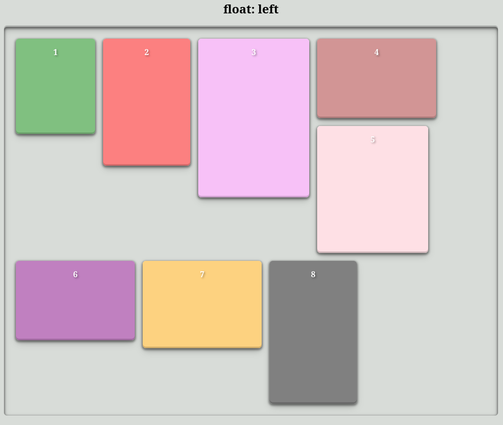
The "Float: Left" Method
.container_float_left {
    overflow: auto;
    > * {
        float: left;
    }
    &::after {
        clear: both;
    }
}
As you can see, the elements are distributed across rows. This leads to certain limitations. Vertical gaps between elements in a row are determined by the difference between the element's height and the tallest element in the same row. There's also a potential for noticeable horizontal gaps between the last element and the right container boundary.
Based on the conditions/requirements:
Gap size: +/- acceptable if the difference between blocks isn't too large, otherwise not;
Gap uniformity: No, uniformity isn't observed;
No JavaScript: Acceptable;
Adaptability: Acceptable;
Dynamic adaptability:Acceptable.
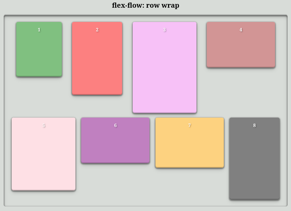
The "Flex-flow: row wrap" Method
.container_flex_row_wrap {
    display: flex;
    flex-flow: row wrap;
    justify-content: space-evenly;
}
The elements are distributed across rows, similar to the previous method, but thanks to justify-content: space-evenly, the empty spaces between adjacent elements in a row are equal.
Based on the conditions/requirements:
Gap size: +/- acceptable if the difference between blocks isn't too large, otherwise not;
Gap uniformity: Partially, only between adjacent elements in a row;
No JavaScript: Acceptable;
Adaptability: Acceptable;
Dynamic adaptability: Acceptable.
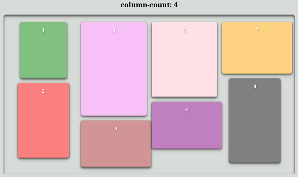
The "Column-count: 4" Method
.container_columns {
    column-count: 4;
    column-gap: 0;
    > * {
        display: inline-block;
    }
}
At first glance, this looks promising. Minimal gaps, as the blocks are distributed in columns rather than rows. However, uniformity between columns is lacking. A drawback is that the number of columns needs to be specified manually, so adaptability can only be achieved with @media rules for each screen size. Dynamic change support is out of the question.
It's important to note that if the inner blocks aren’t configured to be inline, they will be split across multiple columns.
Based on the conditions/requirements:
Gap size: Acceptable;
Gap uniformity: Partially, only between blocks in columns;
No JavaScript: Acceptable;
Adaptability: Acceptable with the use of @media rules for each screen size;
Dynamic adaptability: No.
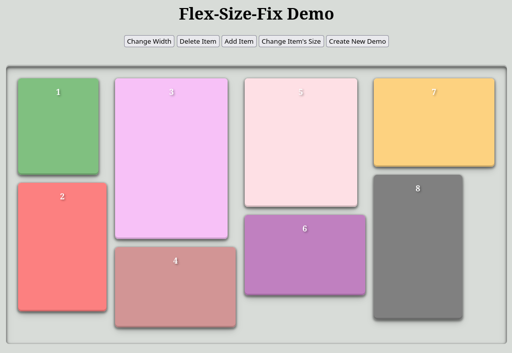
My Method: "Flex-flow: column wrap" + JavaScript Script
/*Example CSS*/
.container_column_wrap {
    display: flex;
    flex-flow: column wrap;
}
This approach leverages the "flex" layout mode with the flex-flow: column wrap property. Without limiting the container's height, we would simply get a single column with all nested elements. However, by setting a specific height, we achieve the desired effect, as shown in the illustrative image. As you might guess, the script calculates this height and monitors for changes to the page, re-calculating as needed.
The core idea is to set an initial height (deliberately smaller than the actual height) for the container, and then gradually increase it in small steps until overflow is eliminated. The optimal height is then the result of this process. Overflow is detected by comparing .scrollHeight with .offsetHeight (for height) and .scrollWidth with .offsetWidth (for width).
Here's a snippet of the code that calculates and sets the container's height:
/* node - container block */
const step = 10; // height adjustment step

let
    square = 0, // total area of all inner blocks
    max_height = 0; // maximum height of a block

/* Iterate over all child elements to populate the variables declared above */
[...node.childNodes].forEach(child => {
    if (child.nodeName === '#text') return;
    square += child.offsetHeight * child.offsetWidth;
    if (child.offsetHeight > max_height) max_height = child.offsetHeight;
});

/* Calculate the initial height */
let start_height = square / node.offsetWidth;
if (start_height < max_height) start_height = max_height;

/* Set the initial height */
if (!isNaN(start_height)) node.style.height = start_height + 'px';

/* "Increment the container's height ("node") iteratively until
overflow in height (.scrollHeight > .offsetHeight) and width (.scrollWidth > .offsetWidth) is eliminated" */
let savety = 1000;
while ((node.scrollHeight > node.offsetHeight || node.scrollWidth > node.offsetWidth) && savety) {
    node.style.height = parseInt(node.style.height) + step + 'px';
    savety--;
}const
get_scroll_parent = node => node.parentNode?.scrollTop ? node.parentNode : node.parentNode ? get_scroll_parent(node.parentNode) : null,
scroll_parent = get_scroll_parent(node), // find the parent with scrolling, if any
current_scroll = scroll_parent ? scroll_parent.scrollTop : null; // remember the current scroll position
...
/* "Adjust the block's height" */
...
if (current_scroll && current_scroll !== scroll_parent.scrollTop) scroll_parent.scrollTo({ top: current_scroll, behavior: 'instant' }); // fix scrolling, if neededSince the script's intervention is minimal, you have full access to a wide range of CSS properties for customization. However, you are restricted from directly modifying the following CSS properties:
display;
flex-flow;
flex-direction;
flex-wrap;
flex-shrink;
flex-grow.
How to Use:
Download the script and link it to your page, or copy the entire code into a <script> tag within the <head> or <body> of your HTML.
Activate the target container blocks by adding the data-flex-size-fix attribute.
Script Connection (just in case):
<script language="JavaScript" src="./flex_size_fix.js"></script>
Initializing target container blocks with the data-flex-size-fix attribute:
...
<div data-flex-size-fix>
...
</div>
...
An interactive example can be tried here.
Based on the conditions/requirements:
Gap size: Acceptable;
Gap uniformity: Acceptable;
No JavaScript: No, but minimal intervention;
Adaptability: Acceptable;
Dynamic adaptability: Acceptable.
Note: I struggled to come up with a catchy name for the script. I concluded that the hyphenated phrase "Flex-Size-Fix" reasonably reflects the script's purpose.
P.S. It's also worth mentioning a well-known plugin that solves this problem, but unfortunately, I'm drawing a blank on its name and can't find it online. It positions and arranges the inner blocks absolutely. If you know it, please write in the comments.